


Custom Gold Foil Map Artworks: A Love Story Across Rome & Brisbane

This year – 2026 – marks 10 years of Tiny Giraffe! Six years earlier, I had fallen in love with San Francisco and couldn't find the perfect artwork for my wall. So I drew a map of the place I left my heart, and others followed.
My maps began with crisp digital linework. Fine art cotton rag paper. Block colours.
They were simple, elegant and modern. A way of bringing the memories of my favourite travels into my life, long after I'd returned home.
I never imagined where those maps would eventually lead – I have followed my intuition to bring my map artworks to life in a variety of wonderful ways.
Today they've evolved into hand-painted watercolour maps, luxury gold foil letterpress editions, sprawling abstract watercolour farm maps, hiking trails and even illustrated night sky constellations. They've never been just maps.
They're stories, moments and memories.
They're the places we celebrated, cherished and loved.
They're also the places we dream of visiting or feel called to visit.
This is the story of a lovely couple who commissioned me to create their story through map artworks.
A Commission I Will Never Forget
Some commissions stay with me because of the people.
Others because of the story.
This one was both.
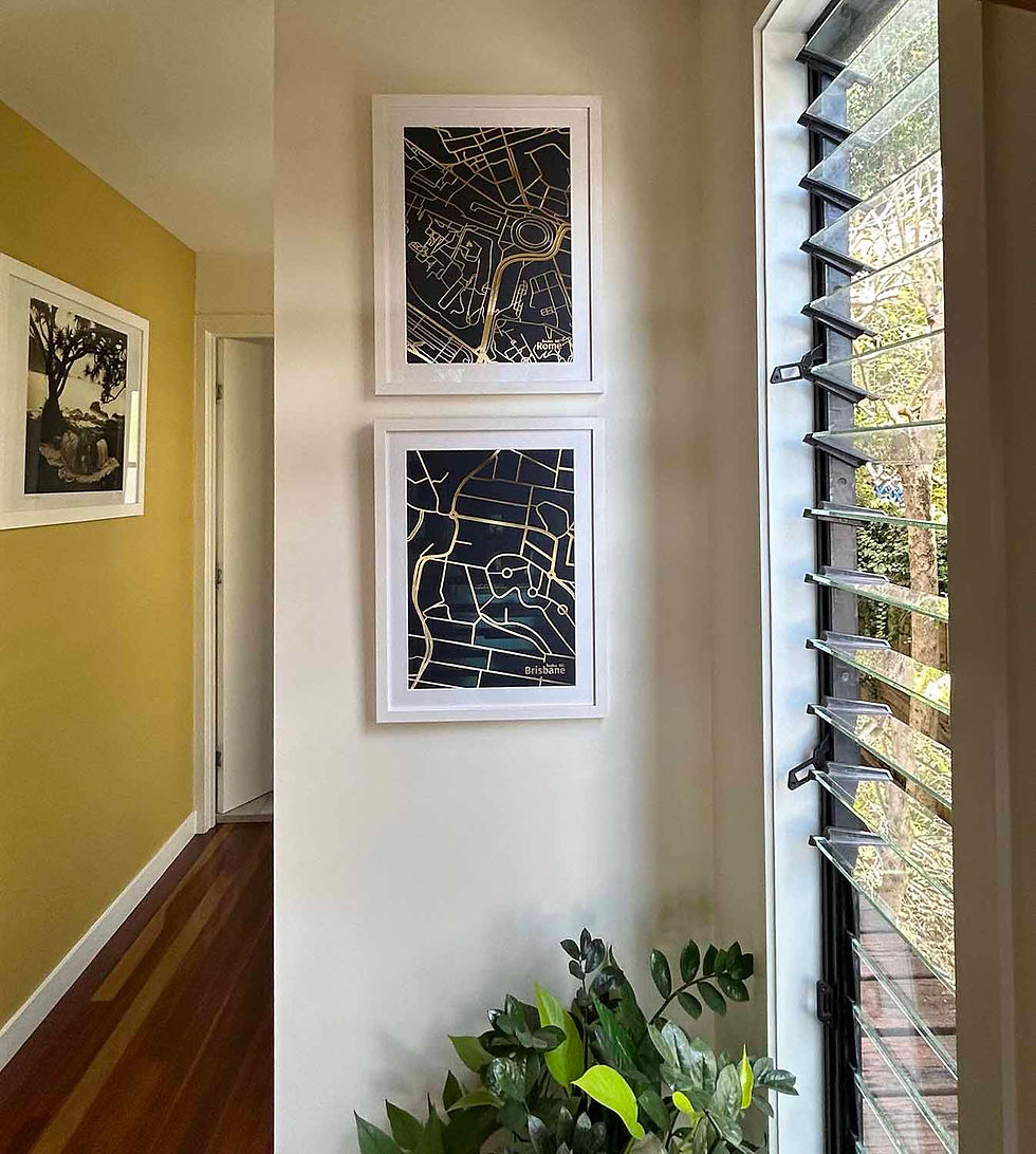
My clients married in Rome before buying a home and beginning their life together in Brisbane. My client shared with me how serendipitous it was to her and her husband that both places have the same name – Palatine Hill.
One is located in ancient Rome, near The Forum (it was fun to see their wedding photos circa early 2000's!).
The other is nestled within the eastern suburbs of Brisbane, where Palatine Hill rises up in the suburb of Seven Hills.
Two hills. Two countries. One love story.
That little discovery became the entire concept for creating the artwork pairing.

Designed As A Pair
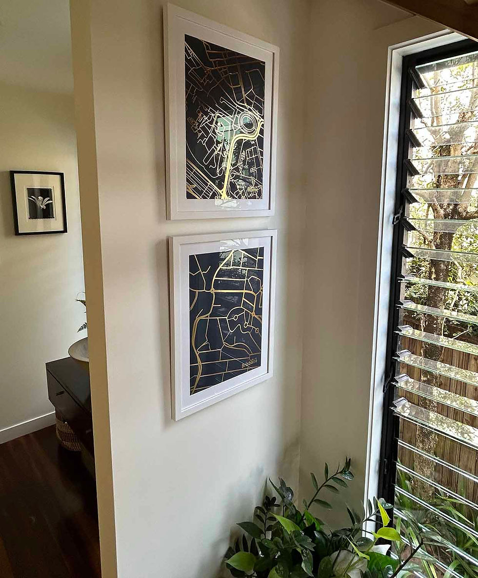
Rather than creating one artwork with both cities, we designed two to sit alongside each other.
Each map was drawn at exactly the same scale so they felt connected despite representing cities on opposite sides of the world. It also helps my clients appreciate the scale of the cities, with Rome being much more dense and urban.
I drew simple icons/illustrations to mark the location of the church where they were married and the home they built together in Brisbane.
Those tiny symbols are often my favourite part of a commission. They're quite small on the artwork so they could appear invisible to anyone else, but to this family, they hold everything.

Why I Love Gold Foil Letterpress
I am always drawn to high quality materials and craftsmanship.
Letterpress has been used for centuries – it is a traditional relief printing technique and is a process that honours the way we used to print words and letters and shapes onto the page.
One of my talented friends Nicole introduced me to this process. She is a graphic designer/typographer and she has two letterpress machines. I fell in love with the work she created and believe it creates a wonderfully timeless artwork.
The tactile nature of the debossed gold foil gives slight depth and texture to the paper. I also love that there are imperfections with the foil – the mark of human hands and giant machine having worked together.
You will often see tiny scratches or dents in the gold, or areas where the gold may not have pressed perfectly. From far away, it looks divine but up close you can see beautiful markings and each one is individually pressed, and therefore individually unique.
How Gold Foil Letterpress Map Artworks Are Made
People often ask me how these artworks are made.

A Digital Artwork is Drawn
I create all of my map artworks by drawing each street and waterway by hand. I play with lineweights for street heirarchy and what feels right for the artwork size. Then I create personalised icons, illustrations, text and hand lettering and integrate this into the artwork.
After I finish creating the artwork digitally, the artwork is sent to a boutique Australian print house.
Together, from the beginning, we choose the right art size, paper colour and foil colour for your space (and identify how this will look with the frame size and colour) before the artwork goes to print. For every project I create a mockup so you can understand how it will look on the wall.
With regards to size, I work with a specialist foil letterpress printer who can work up to A1 size. It is my dream to create a series of large scale foil letterpress artworks.
A Custom Metal Die is Created
A metal die is essentially a metal plate that is heated and molded into the image of the artwork. The plate presses (or 'stamps') the artwork onto the paper.
Letterpress Printing
That die is then heated and pressed into thick 300 or 400 gsm paper with metallic foil, creating linework that is both beautifully reflective and physically debossed (indented) into the sheet. As a result, every street can be felt beneath your fingertips.
The result is something that's difficult to appreciate in photographs.
The paper remains soft and matte, while the gold foil catches the light as you move around the room. If you think it's stunning during the day, wait until you see it in the moonlight at night! I am often amazed by how the artwork catches my eye late at night.
The contrast between matte paper finish and reflective, shiny foil is a stunning and unique finish.
Once I have received the beautiful gold foil pieces, I take them to my framer for a high quality, ready-to-hang artwork that I can deliver to my clients.

A Custom Gold Map Artwork designed to last generations
One of the interesting things about letterpress is that almost all of the cost is in producing the custom die.
Printing one artwork isn't dramatically cheaper than printing ten.
That makes this process especially suited to milestone events and special anniversaries (this project celebrated 20 years of marriage) or projects where multiple editions provide exceptional value — whether as gifts to many family members, boutique hotels with many rooms, residential developments with many floors or commemorative collections.
Once the die exists, it can be paired with different foil colours and papers to create entirely new editions while preserving the original artwork. I have a wide range of beautiful paper and foil colours to choose from.
So far I've tested the following combinations with tremendous success:
gold foil on navy paper
gold foil on white paper
rose gold foil on black paper
silver foil on white paper
pink foil on white paper.
One combination I am dying to try is gold or copper foil on a forest green paper.
Below you can see my Paris gold foil map artwork.

From Conversation to Heirloom Artwork
My favourite emails almost always arrive after installation.
"They are up and we love them!"
Those six words represent weeks of conversations, sketch layouts, drawing, refinements, printing and careful framing. They also mark the moment when the artwork finally becomes part of someone's everyday life.
Sometimes I wonder what will happen decades from now.
Perhaps these maps will hang in the family home for years.
Perhaps one day they'll be passed on to children or grandchildren.
Perhaps someone will ask, "Why do we have two maps?"
And the story will be told all over again.
That's why I create maps.
Not simply to show people where they live.
But to honour the places they left their hearts, so that stories can be shared.
Left your heart somewhere?
Every map I create begins with a conversation.
Whether it's the city where you met, the farm that's been in your family for generations, the hiking trail that changed your life or the place you now call home, I'd love to hear your story.
✨ Explore bespoke map artworks and commission your own →

